
TL;DR:
- Effective landing pages focus on a clear goal, audience targeting, and minimal friction.
- Key elements include benefit-driven headlines, single strong CTA, and social proof near the CTA.
- Continuous A/B testing, prioritizing speed and simplicity, boosts conversion rates significantly.
You’re spending money driving traffic to your landing pages, but the numbers just aren’t moving. Visitors arrive, scroll a little, and leave. That’s not a traffic problem. It’s a conversion problem, and it’s costing you real revenue every single day. Single CTA pages convert at 13.5% compared to just 10.5% for pages cluttered with five or more links. That gap compounds fast at scale. This guide walks you through every stage of building and optimising a landing page that actually converts, from the planning essentials to the testing workflow that keeps results climbing.
Table of Contents
- What you need: Planning an effective landing page
- Crafting high-converting landing page elements
- Optimisation workflow: Testing, refining and fixing mistakes
- Real-world examples: What winning landing pages have in common
- Our perspective: Why real improvement means prioritising simplicity and speed
- Level up your landing page with expert help
- Frequently asked questions
Key Takeaways
| Point | Details |
|---|---|
| Single CTA wins | Landing pages with one focused call to action convert significantly better than cluttered layouts. |
| Headline impact | A clear, benefit-led headline can lift conversion rates by up to 34 percent. |
| Video and social proof boost trust | Embedded video and multiple reviews drive far higher conversion rates. |
| Test and refine regularly | Continuous testing and simple, rapid changes keep landing page performance improving. |
What you need: Planning an effective landing page
Before you touch a single pixel or write a single word of copy, you need a clear picture of what success looks like. Skipping this stage is the single most common reason landing pages underperform. You can have brilliant design and sharp copy, but if the page isn’t built around a specific audience and a single, focused goal, it will leak conversions at every turn.
Start by defining your target audience with precision. Not just “small business owners” or “women aged 25 to 45.” Go deeper. What problem are they trying to solve right now? What language do they use to describe it? What objections will they have before they click your CTA? The answers to these questions should shape every headline, every image choice, and every word on the page.
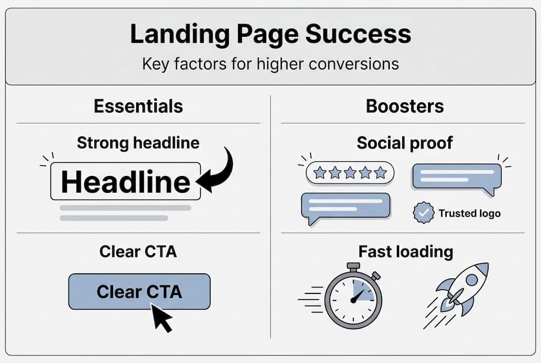
Next, audit the assets you have available before you build. The data is clear: video and social proof are two of the highest-impact elements you can include, with video increasing conversions by 86% and five or more reviews multiplying them by four times. If you don’t have these assets ready, gather them before you launch.
Here’s a quick checklist of what you need in place:
- Audience profile: Defined pain points, goals, and objections
- Copywriting expertise: Someone who writes for conversion, not just for clarity
- Design resource: A layout that guides the eye toward action
- Social proof assets: Testimonials, reviews, case study snippets, or star ratings
- Video content: A product demo, explainer, or customer story
- Tracking setup: Google Analytics, a heatmap tool like Hotjar, or your CRM’s conversion tracking
- Single defined goal: One action you want the visitor to take
| Planning element | Why it matters |
|---|---|
| Audience definition | Shapes copy, offer, and tone |
| Social proof assets | Builds trust before the ask |
| Video content | Boosts conversions by up to 86% |
| Conversion tracking | Tells you what’s working and what isn’t |
| Single CTA | Removes decision fatigue |
Pro Tip: Use session recording tools to watch how real users behave on your existing pages before you redesign anything. You’ll spot friction points in minutes that analytics alone would never reveal. Pair this with content conversion strategies to align your messaging with what your audience actually responds to.
Once your assets and goals are locked in, map out your conversion workflow so every element on the page has a deliberate role in moving the visitor forward.
Crafting high-converting landing page elements
With your preparation complete, it’s time to build. Each element of your landing page either earns trust and drives action, or it creates doubt and bleeds conversions. There’s very little middle ground.

The headline is everything. Visitors decide within seconds whether to stay or leave, and your headline is the first thing they read. Benefit-focused headlines outperform feature-led ones consistently, with headline changes alone yielding up to a 34% lift in conversion rate. The difference is simple: features describe what something is; benefits describe what it does for the reader. “AI-powered chatbot” is a feature. “Never miss a lead, even at 2am” is a benefit.
Here’s a step-by-step approach to building your core page elements:
- Write your headline last. Draft your full page first, then distil the single biggest benefit into a headline that speaks directly to your audience’s primary desire.
- Place your CTA above the fold. Don’t make visitors scroll to find out what to do next. Your button should be visible immediately, with clear, action-oriented text like “Get my free quote” rather than the generic “Submit.”
- Choose images that support the message. Avoid stock photos that look staged. Use real product images, behind-the-scenes shots, or customer photos. Authentic visuals build credibility fast.
- Embed video near the top of the page. Video on landing pages increases conversions by 86%. Keep it under 90 seconds and lead with the problem you solve, not your company history.
- Position testimonials close to your CTA. Social proof placed immediately before or after your call to action reduces the last moment of hesitation before a visitor commits.
Key stat: Pages with a single CTA convert at 13.5%, while pages with five or more links drop to 10.5%. Every additional link is a potential exit route.
When it comes to forms, shorter nearly always wins. Every additional field you add reduces the likelihood of completion. Ask only for what you genuinely need at this stage of the relationship. You can collect more information later.
| Element | Weak approach | Strong approach |
|---|---|---|
| Headline | “Our software has 50 features” | “Cut your admin time by half this week” |
| CTA button | “Submit” | “Start my free trial today” |
| Social proof | One quote at the bottom | Five or more reviews near the CTA |
| Video | No video | 60 to 90 second explainer above the fold |
| Navigation | Full site menu visible | No navigation, single focused page |
For more on how design decisions translate directly into revenue, explore conversion for business growth and practical landing page design tips that apply across sectors.
Pro Tip: Remove your site’s main navigation from your landing page entirely. Every menu link is an invitation to leave. Focused pages with no navigation consistently outperform pages that let visitors wander.
Optimisation workflow: Testing, refining and fixing mistakes
Building a great landing page is not a one-time event. The brands that consistently outperform their competitors treat optimisation as a permanent, structured process rather than an occasional tweak. Here’s how to build that process.
Start with A/B testing on the highest-impact elements first. Don’t test button colours before you’ve tested your headline. The hierarchy matters. Test in this order:
- Headline: Benefit-led versus feature-led, or two different benefit angles
- Hero image or video: Static image versus embedded video, or two different video styles
- CTA text: Generic versus specific, or urgency-based versus value-based
- Form length: Three fields versus six fields
- Social proof placement: Above the CTA versus below it
Run each test long enough to reach statistical significance. A common mistake is calling a winner after 50 visits. You need enough data to be confident the result is real, not random noise. Most tools will tell you when you’ve reached significance.
Track these KPIs consistently:
- Conversion rate: The percentage of visitors who complete your goal action
- Bounce rate: The percentage who leave without interacting at all
- Scroll depth: How far down the page visitors typically get before leaving
- Time on page: A rough indicator of engagement and content relevance
- Form abandonment rate: Where in the form visitors drop off
“The brands that win aren’t the ones with the most creative pages. They’re the ones with the most disciplined testing processes.”
Common issues that quietly destroy conversion rates include slow load times, unclear value propositions, and forms that ask for too much too soon. A page that takes more than three seconds to load loses a significant portion of its audience before they’ve even seen your offer. Use Google PageSpeed Insights to identify and fix speed issues quickly.
Single CTA pages convert at 13.5% for a reason: clarity drives action. If your page tries to do three things at once, it will do none of them well. Revisit your conversion workflow regularly and use the data to boost landing page results over time rather than chasing one-off wins.
Pro Tip: Set a recurring monthly review in your calendar. Pull your KPIs, identify the single biggest friction point, and run one focused test to address it. Small, consistent improvements compound into significant revenue gains over a quarter.
Real-world examples: What winning landing pages have in common
Theory is useful. Real examples are better. Here’s what high-performing landing pages in British e-commerce and service sectors consistently do differently.
A British online retailer selling premium homeware redesigned their product landing page to lead with a benefit-based headline, removed the site navigation, and added a 75-second product video above the fold. They also added a row of verified customer reviews directly above the purchase button. The result was a measurable lift in conversion rate within the first two weeks of the change going live.
A SaaS business offering project management tools for small agencies replaced their feature list headline with a single outcome-focused statement. They cut their sign-up form from seven fields to three. Conversion rate on their free trial page increased substantially, and form abandonment dropped.
A UK-based service business in the professional services sector added social proof with five or more reviews directly to their enquiry landing page, positioned just above the contact form. Conversion rates increased by close to four times compared to the version with no visible reviews. That’s not a marginal improvement. That’s a business transformation.
| Business type | Change made | Outcome |
|---|---|---|
| Homeware retailer | Video, benefit headline, reviews near CTA | Conversion rate lift within 2 weeks |
| SaaS (project tools) | Outcome headline, form reduced to 3 fields | Higher trial sign-ups, lower abandonment |
| Professional services | 5+ reviews above contact form | Near 4x conversion rate increase |
What do all three have in common? They simplified. They removed friction. They led with benefit, not feature. And they placed social proof where it could do the most work, right at the moment of decision.
The lessons here are straightforward to model. You don’t need a complete redesign. Start with one change, measure it, and build from there. For a broader view of how digital strategy drives these kinds of results, see how digital agencies transform online presence and explore a digital marketing case study showing what’s possible with the right approach.
- Remove navigation from campaign-specific landing pages
- Lead with the outcome your audience wants, not the product you sell
- Place reviews and testimonials immediately before your CTA
- Use video to do the heavy lifting on trust and explanation
- Test one element at a time and let data, not opinion, decide
Our perspective: Why real improvement means prioritising simplicity and speed
Here’s something we’ve seen consistently across the brands we work with: the businesses that over-engineer their landing pages almost always underperform the ones that keep things ruthlessly simple. There’s a temptation, especially in competitive markets, to add more. More features, more social proof widgets, more interactive elements, more copy. It feels like more effort equals more results. It rarely does.
The most effective landing pages we’ve seen share three qualities. They load fast, they say one clear thing, and they ask for one clear action. That’s it. A page that loads in under two seconds, leads with a single benefit-driven headline, and has one obvious CTA will outperform a beautifully designed, feature-rich page that takes four seconds to load and has three competing calls to action.
Speed is particularly underestimated. Every additional second of load time costs you a portion of your audience before they’ve read a word. In the British market, where mobile usage is high and patience is low, this matters enormously.
The brands that acted on simplicity first, before testing anything else, saw the fastest gains. Clear frameworks and focused pages beat creative experiments nearly every time.
Level up your landing page with expert help
If this guide has shown you the gap between where your landing pages are and where they could be, the next step is getting the right team behind you.
At NU Life Digital, we build conversion-focused web design that’s engineered around evidence, not guesswork. From benefit-led copy and strategic layout to AI automation solutions that handle leads the moment they arrive, we build pages that work harder for your budget. Whether you’re starting from scratch or optimising an existing page, we’ll show you exactly where your conversions are being lost and how to fix it. Explore our conversion lift strategies or get in touch to talk through your specific goals with our team.
Frequently asked questions
What is the most important part of a landing page for conversions?
A benefit-led headline is the single most critical element, with headline changes delivering up to 34% lift in conversion rate. It’s the first thing visitors read and the primary factor in whether they stay or leave.
How many calls to action should a landing page have?
One. Single CTA pages convert at 13.5% compared to 10.5% for pages with five or more links. Every additional option dilutes focus and reduces the likelihood of any action being taken.
Does adding video really help landing page conversions?
Yes, significantly. Pages with embedded video see up to 86% higher conversions than those without. Keep it concise, lead with the problem you solve, and place it near the top of the page.
What type of social proof works best?
Displaying five or more genuine reviews can increase conversion rates by four times. Position them directly above or beside your CTA for maximum impact at the point of decision.
Recommended
- Boost revenue with top website conversion optimisation tips – Nu Life Digital
- How content drives conversion rates: key strategies 2026 – Nu Life Digital
- Website conversion: the key to business growth in 2026 – Nu Life Digital
- Website conversion workflow that drives measurable growth – Nu Life Digital